Colors In Photography – Learn How To Achieve Color Harmony

Using the right colors can help you achieve color harmony
Today we will be covering the basic fundamentals on colors in photography. This will include introducing you to the basic color theories and discussing how you can use these theories to achieve color harmony in your macro photography photos.
As you know, the human eye can see and process a wide spectrum of colors. Even without any formal education in arts or design, the human eye (and brain) will often be able to ‘sense’ whether specific colors will work together. Of course, some people have better success than others.
Instead of relying purely on your senses to determine whether colors will work together or not, we want to equip you with the basic color theories so that you know how to achieve ‘color harmony’. When we refer to color harmony, we are referring to a set of colors that will work harmoniously together to achieve an image that is pleasing to the eye.
Colors In Photography – The Color Wheel
The color wheel was invented by Isaac Newton and it is a tool that will assist us in determining whether our colors are in harmony. Without boring you with the details of the color wheel, what I want you to remember is that there are three primary colors – RED, YELLOW and BLUE. The colors between them are secondary colors and they are achieved by adding different mixtures of the primary colors together. For example, adding more yellow to red will help to achieve an orange color. If you then mix the primary color with the secondary color, it will result in the tertiary colors that are in between.
Colors In Macro Photography – The Color Wheel
1. Colors In Photography – Using Monochromatic Colors
The first way to achieve color harmony is through the use of monochromatic colors. Don’t let the big long word scare you, but it essential means that we using different tones, tints, shades of a single (mono) color (chromatic). To achieve this, we pick a color on the color wheel and we add more black, white or grey to our chosen color.
This creates a visually appealing image that is balanced. However, you will find that it may lack color contrast.
Colors In Photography – Monochromatic Harmony
Color in Photography – Mono chromatic color harmony
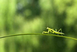
2. Color Harmony – Analogous Colors
The second way to achieve color harmony is through the use of analogous colors. Once again do not be intimidated by the name. This basically relates to the selection of a group of colors that are similar (analogous) and blend well together. To achieve this, we first select a main color from our color wheel. We then select 2 adjacent colors to our main color. You can select one color on either side or 2 colors from one side.
Luckily for us macro photographers, this group of colors occur quite frequently in nature. Think about the leaves on a tree going through the different seasons. It can change from green to yellow to red.
This creates an image that is richer than the monochromatic colors. However, sometimes it may not look vibrant as it lacks color contrast.
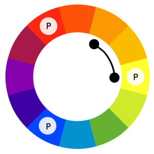
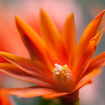
Colors In Photography – Analogous Harmony Example
Colors in Photography – Analogous color harmony

What are the analogous colors in this photo? Hint: This is a wider selection of adjacent colors.
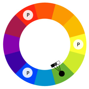
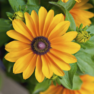
3. Color Harmony – Complementary Colors
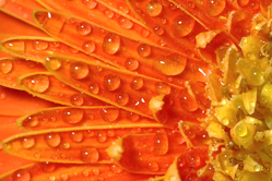
The third way to achieve color harmony is through the use of complementary colors. This is the selection of colors that when combined together, will provide a high contrast image. To achieve this, you select the main color on your color wheel. You will then select another color that is opposite of your selected color. Choosing your colors in this manner will help to make something stand out.
Ultimately, this creates an image that is high contrast and vibrant. However, as you will probably experience, it can be difficult to balance the colors.
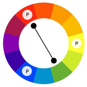
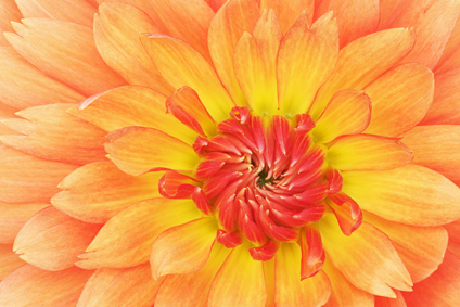
Colors In Photography – Complement Harmony

Colors in Photography – Complementary color harmony

What are the complementary colors for this photo?
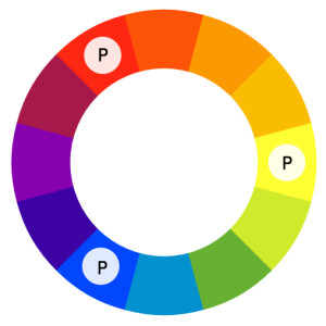
4. Color Harmony – Triadic Colors
The fourth way to achieve color harmony is through the use of triadic colors. As the name ‘triad’ suggests, this method involves using three different colors. To achieve this, you first select your key color in the color wheel. You will then need to select another two colors that are evenly spaced from your key color. If you have done this correctly, this will eventually form a triangle.
Triadic colors will help to achieve a vibrant image with high contrast. When comparing this to complementary colors, it does not offer as much contrast.
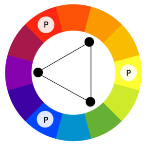
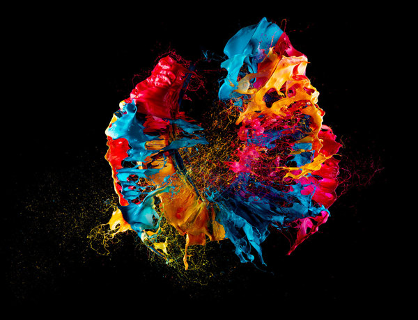
Colors In Photography – Triadic Harmony Example
Colors in Photography – Triadic color harmony

What are the triadic colors of this photo?
When you are composing your next shot, it is worthwhile keeping the different color harmony types in the back of your mind as this will help you to create photos that are pleasing to the eye. Colors in photography matters but remember… at the end of the day, you are the artist and sometimes these rules and theories are meant to be broken.
You may also be interested in this –